Rebranding IfLooksCouldKill
Posted by Sarah RobertsonYou could be forgiven for thinking that rebranding your own design studio would be a simple task, but the truth is, it can be a tricky process.
How do you reinvent yourself without diluting your brand message or risking client relationships? Can you take an unbiased approach to the creative process without overworking a concept? How will you mark the change and create impact while ensuring a smooth transition?
Here, I talk about the reasons behind our rebrand and the key decisions taken along the way. The process, from start to completion, took close to 6 months, beginning with the creation of a vision board through to the receipt of our new business cards. This month, the work culminated in the launch of our new website.
Why rebranding was important to us
Businesses choose to rebrand for many reasons, and the process takes many forms. It can involve changing a company name, its logo and colour palette. Also, symbols and imagery, content and key messages, or any combination of these.
One of the catalysts for us was the merging of our first design studio, Creative State, with a business we later acquired, IfLooksCouldKill. Each was a successful company in its own right, with a reputation for producing effective design and meaningful results. And the first task (an incredibly tough task!) was deciding which company name to move forward with.

The support gave us the energy to embrace the rebrand, put our stamp on the design studio, and create something that we could truly call our own.
Creative State was my first business, which I started in 2005 at the age of 21, and I have many happy memories of what was achieved over many years of running the studio. These include winning my first project and stepping back from freelance work when I began making a living from my own client base. Also, inviting my partner, Jonathan, to join me in the business 10 years ago.
As you can imagine, making the decision to let that business go wasn’t easy. This change-making process involved surveying clients, discussing our ideas with colleagues and peers, and even asking family and friends for input. I instinctively felt that IfLooksCouldKill was the stronger of the two names and this was, after all, a business decision. So it was a comfort when the feedback from others (mostly!) married with my own thinking. The support gave us the energy to embrace the rebrand, put our stamp on the design studio, and create something that we could truly call our own.

Exploring a brand identity
We first got to work on a vision board to help us establish the direction we wanted to go in. Time was taken to explore who we are and why that matters, the clients we want to attract, and how we came across. We also thought about what it is that we ultimately want to achieve by rebranding and relaunching our website.
This process helped to re-establish our core values and flesh out our brand personality. We have also made key decisions around sharing more about who we are, what we do, and how we work, something I’ll be building upon over the coming days and weeks in a short blog series.
I enjoy everything from holding discovery sessions through to presenting ideas, but researching and developing concepts is what I get the most enjoyment out of as a Creative Director.
But first, back to the rebrand, and the parts of the process I love most; creating mood boards, exploring colour palettes and reviewing paper ranges.
There’s nothing quite like a fresh start, and this is the kind of design job that excites me as much today as it did when I won my first client back in 2005. I enjoy everything from holding discovery sessions through to presenting ideas, but researching and developing concepts is what I get the most enjoyment out of as a Creative Director. Very little beats bringing together design thinking and strategy to create a brand identity.
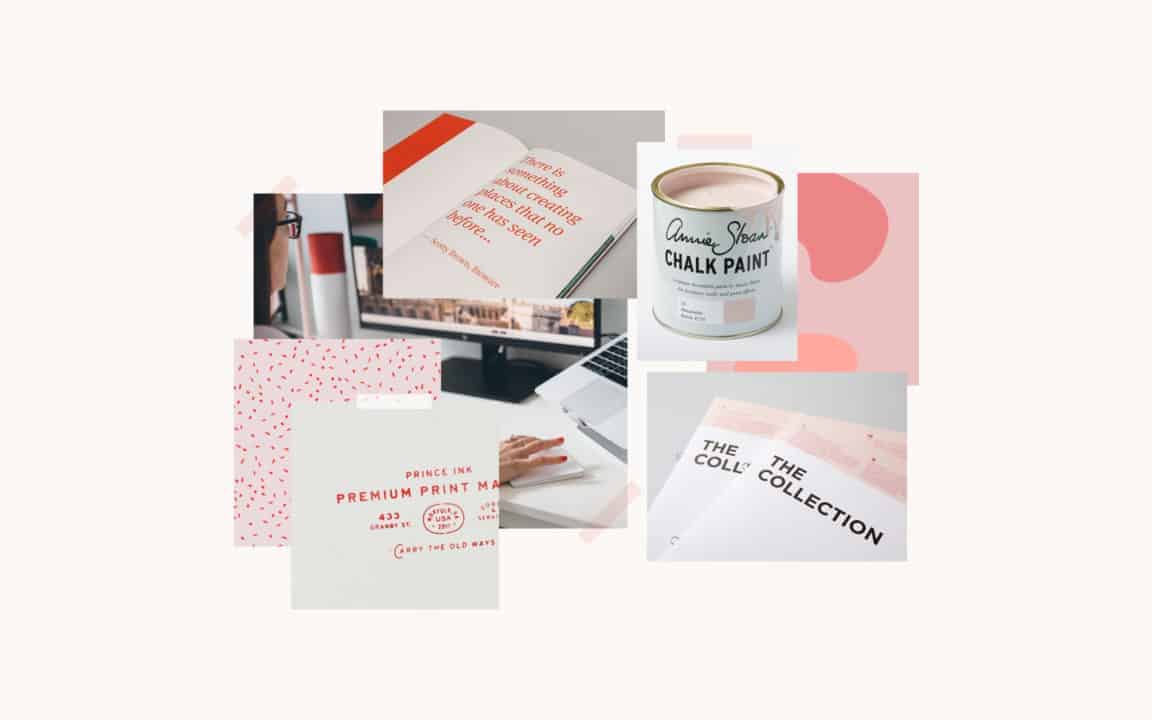
Mood boards are a great way of envisioning the look and feel you want to achieve, and paired with colour swatches and paper samples can make for a fun discovery session. We very much involve clients in this process and, while we go armed with initial ideas, our aim is to bring their vision and our ideas together to create a brand that makes a lasting impression. And it was no different when we came to work on the ideas for our own logo.

Crafting a brand identity
The existing text-only logo had served the company well over the years. However, we chose to modernise the font by adopting URW Geometric Bold. We also incorporated a full stop ‘bullet’ to give the logo slightly more impact while maintaining a minimalist feel, something that’s translated well into the letterpress printing of our business cards as well as digital media.
We were keen to maintain a bold and punchy approach to the colour palette. After going through quite an intensive process eventually settled on a coral red as the main colour, which was complemented with muted pink and light cream shades. All three colours were honed and matched with samples from the GF Smith Extract Papers range; Coral, Shell and Moon.
While our work is important to showcase, we believe it's vital for our personality to shine through.
The paper itself has been transformed from disposable cups, which made it all the more exciting to hold our business cards for the first time! Knowing that 90% of the waste that’s taken from each cup is used, and the remaining 10% of waste – which is plastic – will become something else entirely, ensures that the recycling is a zero-waste process.
With our colour scheme, our primary aim was to add character and bring more vibrancy to our company image, and we wanted to extend this into our photography for the design studio. While our work is important to showcase, we believe it’s vital for our personality to shine through. And this is something I plan to build upon in the upcoming series of posts.
If you’re interested in learning more about us, look out for our ‘behind the scenes’ series of posts coming up over the next few weeks. Thanks for reading and remember to sign up for our newsletter for a boost to your creativity and your business!


